
How To Select Indicators That Will Help You - And How Many Do You Need?
Apr 18, 2018My last blog explored stories as one of the most powerful Virtual Time Machines. In planning, especially land use planning, our stories are captured and shared as scenarios. They are like “short stories” rather than novels. When you develop a land use planning scenario, you have a general sense of where and when but the place to start working out the details is to understand what is important first. The key priorities or values are the starting point – and everything else is connected to this.
"Defining an appropriate set of indicators at the earliest stages of the planning process is crucial because it influences all the subsequent decisions"
In storytelling, these are the characters. In scenario planning, these are the performance indicators. In environmental impact assessment terminology – these are the valued components. Defining an appropriate set of indicators at the earliest stages of the planning process is crucial because it influences all the subsequent decisions including the study area boundary, how the landscape is stratified, and what data and information will be needed. Getting this part right is crucial - so here is a proven method for selecting performance indicators that will help you plan for the future you want.
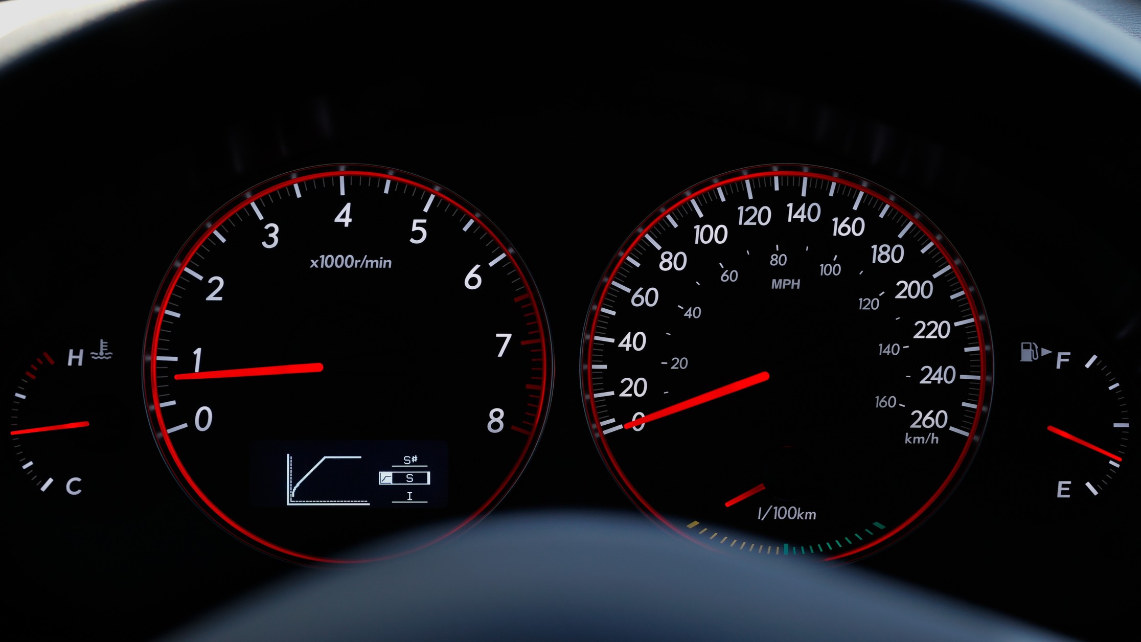
The dashboard in your car or truck is a bunch of indicators that inform you about the performance of your vehicle. For example, you have a speedometer to tell you how fast you are going. You have a fuel gauge so you know how much fuel is left before you hit a critical threshold of running out of gas, and you normally also have a temperature gauge so you know how hot the engine is and therefore how well your cooling system is working. These are all performance indicators.
So you start by making a list of the "key priorities", the values you believe are very important and inevitably you end up with a very big list. Especially when I'm working on planning for the triple bottom line of economy, environment and society - the list of values affected is very big. If the list is too long, then forecasting and measuring can become to onerous and expensive. So, here are the criteria I use to rank the list - I have found these very useful and used them over and again.
1. Cultural, Economic or Ecological Relevance: the indicator is considered important (e.g. food, spiritual significance, quality of life), can be linked to plans and policy and is simple and understandable to the target audience,
2. Response Signal: the indicator has a predictable response to stressors, is sensitive and can provide early warning of change, and has low natural variability,
3. Management Relevance: the indicator is stated in management goals or is applicable to management decisions as a threshold,
4. Feasibility of Implementation: measuring the indicator is affordable, measurement has a low impact on the system, measuring is easy and repeatable - and bonus points if there is existing data,
5. Interpretation and Utility: historic baseline conditions for the indicator are known or can be reasonably estimated, you can distinguish the stress response from natural variability and it helps you identify cause/effect relationships and sensitivity
6. Compatibility with the analysis tool(s) you have or can acquire: the indicator is already available in your forecasting tools or it could be developed easily.
Once you have scored your indicators, use this data to rank them. I have developed a matrix template using an excel spreadsheet that allows me to easily work with this and share it with my clients. I assign a point value to each potential indicator for each one of these criteria. I can then weight the categories evenly or make one more important than the other. This results in an index value that allows me to sort the potential indicators from most useful to least.
You can get a copy of this template here: barryjwilson.com or message me.
"Think back to the dashboard in your car - how many of the indicators do you pay attention to? I'm betting its only 2 or 3"
How many indicators to measure is a delicate balance that provides enough detail to understand system dynamics but that avoids creating an onerous data set. In my experience, I have found that somewhere between 6 and 20 is a good range to be in with the sweet spot somewhere around 8 to 10. I have seen plans that have many more indicators than this and what I typically find is that if the list is too large, the key takeaways become very difficult to find. Think back to the dashboard in your car - how many of the indicators do you pay attention to? I'm betting its only 2 or 3. Even in jets and helicopters - there are 8 - 10 key indicators the pilot keeps their eyes on to fly.
Ultimately, what you want is a list of indicators that helps you understand how effective the strategies you are contemplating will be at moving you closer to your desired future. And you need indicators that you can measure over time in the real world to help you determine if your strategies are working and to improve your model forecasting.
What else do you want to know about selecting indicators?
Leave me a message here and I'll try to find the answer ;) -Barry
images credit: dashboard; Photo by Alan Biglow on Unsplash
